Vehicle Insurance
Claims System
We knew that the users were call center agents. Upon further investigation, we learned that they usually come from car repair shops, which means that they have extensive experience with cars, but a more limited background with computers.
We determined different behavior types of the user, and use this to create different profiles—known in UX as personas—for different categories of users, with the intention of making both current and desired actions easier to perform. As an example, we examined mouse vs keyboard usage: depending on the user’s comfort level, some users preferred to use the mouse while other users preferred to use the keyboard to tab through the fields. Knowing this, we had to solve for both behavior types. We also interviewed the users to determine what functions or information they needed to accomplish their goals.
One of the CSRs’ main goals was to keep the repair facilities’ hold times to under one minute as much as possible, which meant being able to fill out a claim as quickly as possible. Once we learned this, we focused on designing the system to facilitate speed.
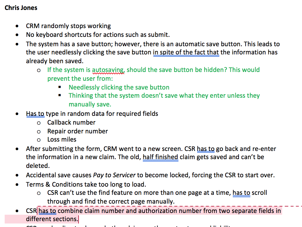
In addition to optimizing based on behavior and goals, we further optimized the experience based on the context in which the system is used. When we examined this context for the CSRs, we learned that they are under psychological pressure to keep call times down. Therefore, system lags would be a source of stress, especially in the absence of a loading indicator to tell them that the system is processing the information (rather than being frozen). We therefore prioritized defects related to system performance and requested the addition of a loading indicator for any processes taking longer than one second.
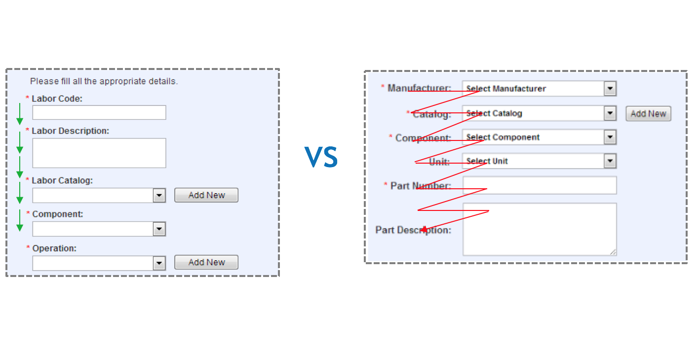
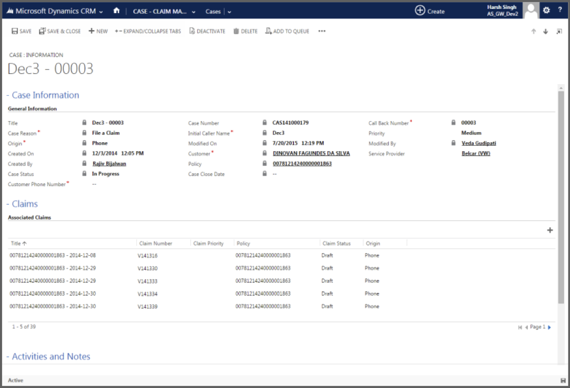
Once we had some ideas for how to make the interface easier and speedier to use, we began to create wireframes to test different concepts and layouts. We studied how the users scanned through the forms during the data entry process, and compared different label placements on the form to drive the fastest form completion approach. Pictured is one example of form layout that we implemented. Top aligned labels resulted in faster form completion but potentially increased vertical scrolling. Right aligned labels required additional time for readability but minimized scrolling. Due to the length of the forms, we hypothesized that left-aligned labels would result in faster completion times. We then validated our hypothesis using an A/B test.
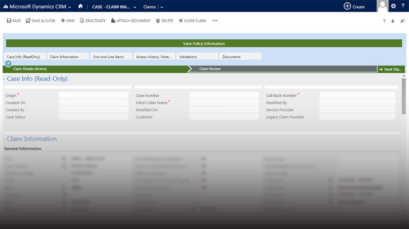
Using the lower fidelity wireframes as a foundation, we created higher fidelity prototypes with a greater focus on visual design. The original design of CRM provided very little visual distinction between labels and fields, as well as among different sections. We increased the visibility of the text boxes and sections, thereby enhancing the visual hierarchy (which gives more visual weight to more important elements).
Once we completed this initial round of research, prototyping, and testing, we examined our findings, made adjustments to the design and prototypes, reviewed the changes, and tested them again. We then ensured that the users were satisfied with the experience by examining quantitative data (such as lag time and claim completion times), as well as obtaining qualitative inputs from the users regarding their satisfaction with the system. Overall, we were able to improve claim response times by over 50%.
© Sam Eastham, 2017