Information Architecture
The first UX deliverable requested for the project was a set of low-fidelity mockups demonstrating the basic interactivity for the interface. Since the flow and IA of the interface would almost certainly need to be significantly reworked after being reviewed by the team, I suggested that a more expedient first step would be to create a user flow based on all possible scenarios. User flows are both faster to produce and easier to review by the team since the visual layout and design is left out of the equation. The team agreed with this approach, so I began by considering our user base.
User research was provided by the client, and suggested that the portal would be used by a wide range of potential user groups (after all, who doesn’t own a cell phone?) However, the user base for the online portal would skew slightly younger and more tech-savvy, since those who are less comfortable with technology would more likely contact the call center. With this user base in mind, I began to work through potential use cases for the portal.
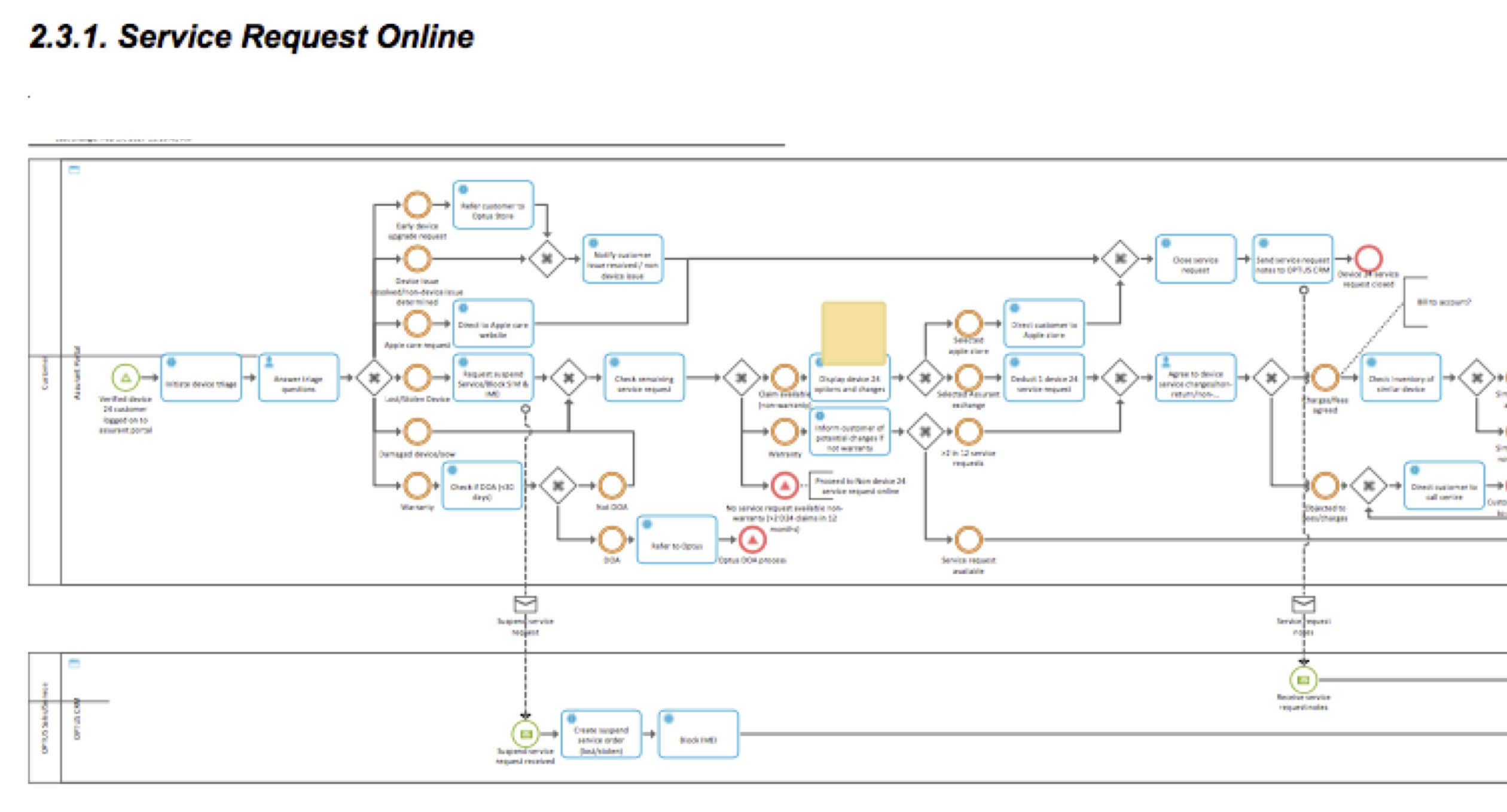
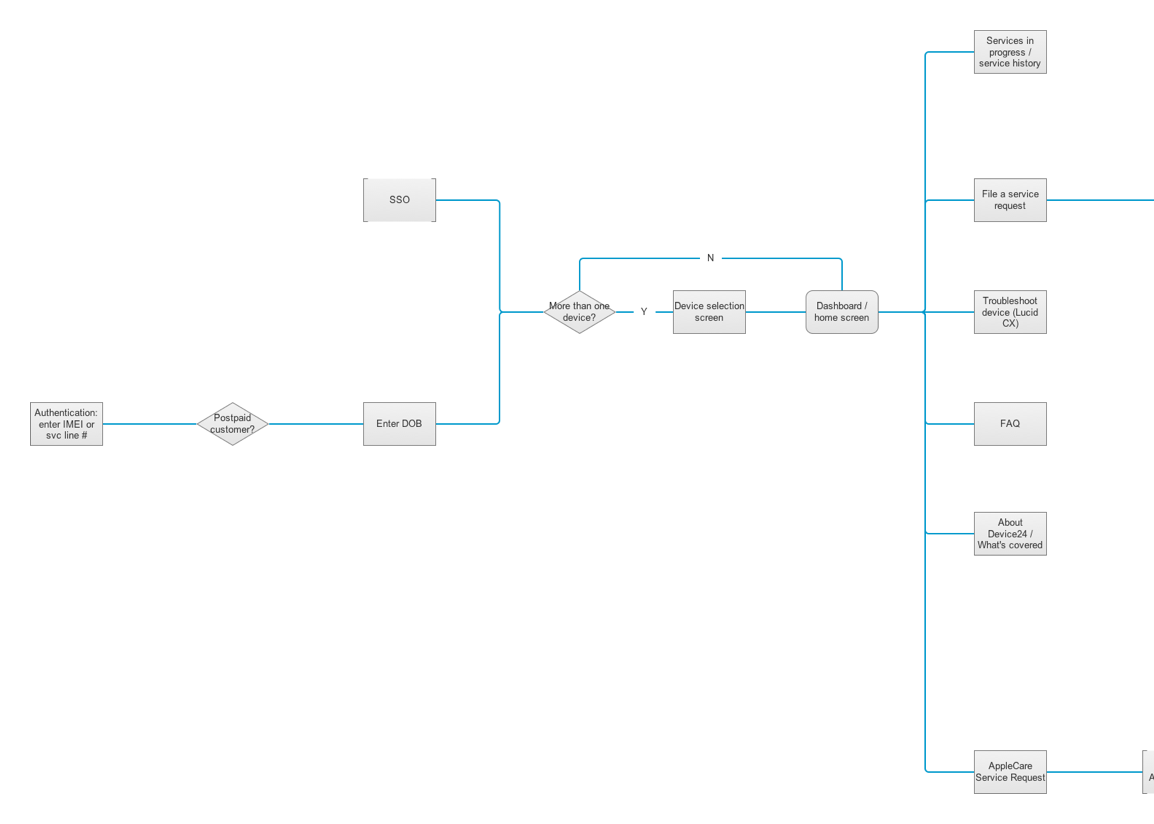
First, the solution has two modes of authentication: log-in through single sign on, or log-in using phone number and account holder’s date of birth or IMEI. Log-in through SSO would require the user to select which device they are filing a claim for, while phone number authentication would take them directly to the associated device. I left these modes as the default “happy paths” for login and proceeded with the rest of the flow. There were many user stories based upon whether the user was a new or returning user, coverage type (paid or free), and depending upon the issue with the device. Examining these user stories, I discovered three primary categories: a definite need to file a service request (such as if the device was lost, stolen or broken), possible need for service request after troubleshooting steps were completed (such as if the device was malfunctioning), and searching for answers to general questions (such as coverage information, terms and conditions of the policy, etc). After deciding on these three primary categories, I continued to branch out the flow depending on issue type and which coverage the customer might have.
After this initial flow was complete, I reviewed it with the rest of the team, and we made a few refinements to the login process. We also discovered further deviations from the “happy path” which I added to the flow for a second draft.
Low Fidelity Wireframes
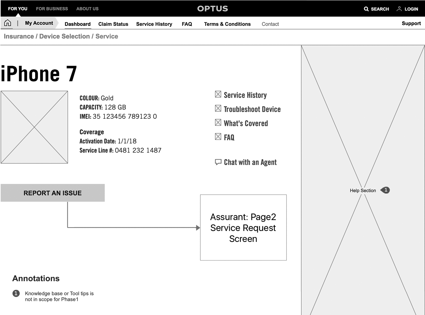
Once the client signed off on the user flows, I began to create low-fidelity wireframes to demonstrate the basic layout and interactivity of the user flows. As I completed the pages, I sent them to the client’s UX designer for approval and sign-off to ensure consistency with the functionality of their system.
Issues uncovered during low-fi wireframing included issues with navigation, layout of elements (the client desired a linear list on all pages rather than a grid layout), as well as further missing requirements (such as what information needed to be listed on the device inventory screen, and how many steps in the trade-in process were needed).
High Fidelity Mockups
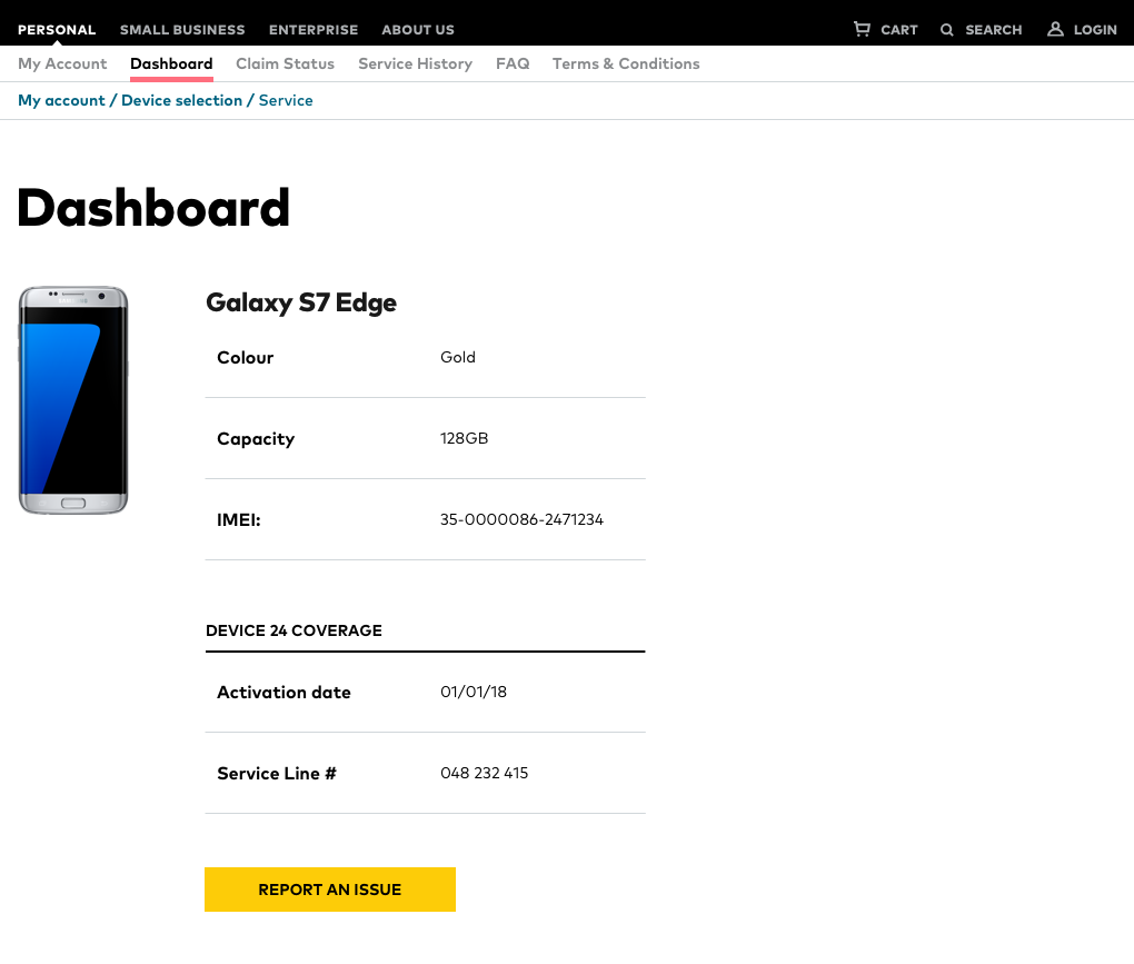
After the client approved the layout and interactivity demonstrated in the final draft of the low fidelity wireframes, I began to enhance the visual design based on the client's style guide. Due to the fact that the style guide was incomplete, I worked with the client's visual designer to fill in the gaps by sending over the pages that differed considerably in terms of layout, and had him apply the styling. I used those pages in addition to the guide as a template to style the remaining pages, and sent the pages over to our front-end development team as they were approved.
Future Steps
Once the solution has been developed, we will perform usability testing to maximize customer satisfaction.
© Sam Eastham, 2017