Case study · Claims operations
Claims platform redesign
I designed and helped develop a claims system that cut average call time in half.
The Problem
In order to unify multiple backend systems, Assurant deployed a new claims system for their customer service representatives to use. Unfortunately, this new system, built using Microsoft Dynamics CRM, was completely new and unfamiliar to the representatives. This caused the quality of service provided by the representatives to drop dramatically due to increased hold times and difficulty processing claims. My objective was to test the usability of the system and suggest enhancements to remedy this issue.
User Research
The fact that the users were call center agents was a given. However, upon further investigation, I learned that they usually came from car repair shops, meaning they had extensive experience with cars, but a more limited background with computers.
I determined different behavior types for different user groups, and used this to create personas for each category, with the intention of making both current and desired actions easier to perform. As an example, I examined mouse vs keyboard usage: depending on the user’s comfort level, some users preferred to use the mouse while other users preferred to use the keyboard to tab through the fields. Knowing this, I solved for both behavior types. I performed user interviews to determine what functions or information they needed to accomplish their goals.
One of the representatives’ main goals was to keep the repair facilities’ hold times to under one minute as much as possible, which meant being able to fill out a claim as quickly as possible. Upon learning this, I focused on designing the system to facilitate speed.
Designing for Speed Under Pressure
In addition to optimizing based on behavior and goals, I further optimized the experience based on the context in which the system was used. In performing this contextual investigation, I found that the representatives were under psychological pressure to keep call times down. Therefore, system lags would be a source of stress, especially in the absence of a loading indicator to tell them that the system was processing the information (rather than being frozen). I therefore flagged defects related to system performance to the developers and requested the addition of a loading indicator for any processes taking longer than one second.
Testing the Forms
After this initial research, I created wireframes to test different concepts and layouts. I studied how the users scanned through the forms during the data entry process, and compared different label placements on the form to drive the fastest form completion approach.
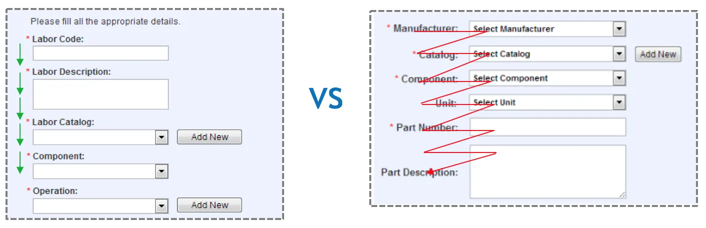
Top aligned labels resulted in faster form completion but potentially increased vertical scrolling. Left aligned labels required additional time for readability but minimized scrolling. Despite the length of the forms, I hypothesized that top aligned labels would result in faster completion times since the users would have to scroll either way. I then validated this hypothesis using an A/B test, which confirmed the hypothesis.
Using the lower fidelity wireframes as a foundation, I created higher fidelity prototypes with a greater focus on visual design. The original design of Microsoft’s CRM provided very little visual distinction between labels and fields, as well as among different sections. In collaboration with the development team, I increased the visibility of the text boxes and sections, thereby enhancing the visual hierarchy (e.g., giving more visual weight to more important elements).
Iteration and Results
Once I completed this round of research, prototyping, and testing, I further examined these findings, made adjustments to the design and prototypes, reviewed the changes, and tested them again. I then followed up with the users to ensure that they were satisfied with the experience. Through a design method that examined quantitative data (such as lag time and claim completion times), and qualitative inputs from the users regarding their satisfaction with the system, I created a redesign that ultimately cut the average call time by over 50%.