Published teardown
One integration, two unrelated storefronts, twenty findings
Extend embedded protection, as deployed by Lorex and Nectar. The measured interaction findings lead — controls under the touch-target minimum, selection state carried in color alone, dialogs that never say what they are — then the disclosure gaps that failed identically on both retailers. An automated accessibility audit of the same component comes back near-clean.
How this was tested
These flows change monthly. Everything below describes what was on screen during a single dated pass, and nothing here was inferred from documentation.
- Tested
- August 14–15, 2026
- Subject
- Extend embedded protection, as deployed by Lorex and Nectar
- Devices
- Desktop 1440×900, mobile 390×844 (emulated)
- Scope
- Product page → cart → protection offer → terms → checkout. Stopped at the payment screen; no purchase completed.
- Protocol
- protection-attach-flow@1.0.0
- Verification
- Flows re-checked from a US IP; prices and offer rendering identical to the first pass.
- Measured
- August 20–21, 2026
- Widths
- Verified inner viewport widths of 1440 and 390px on Lorex, 1440 and 386px on Nectar. Width was read immediately before and after every run rather than assumed.
This is a design review, not a legal or compliance assessment. Contract language is cited below to show the gap between what the offer says and what the agreement says — never to evaluate either against a statute. No finding here asserts a legal conclusion. The Impact column names where the cost lands — disputes, churn, support load, errors — not a judgment that any rule has been broken.
How the numbers were taken. Findings 17 to 22 are DOM measurements — getBoundingClientRect() and computed styles at the verified widths above. Overlay preflight was clear on every run: no consent banner was present on any measured page, and none was accepted, dismissed or interacted with. Coverage is complete across the measured components, and cross-origin frames are reported as not measurable rather than as absent. WCAG 2.5.5, 1.4.3, 1.4.11 and 2.4.7 are named here as the yardsticks the numbers were taken against — as measurement standards, never as obligations and never as a claim that anyone has breached one.
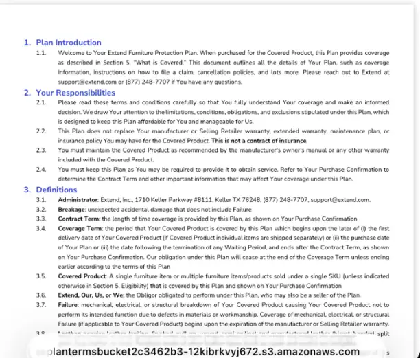
Terminology. These are service contracts, not insurance. The Nectar contract says so in bold at section 2.2 — “This is not a contract of insurance.” They fall under state service-contract acts rather than insurance codes, so the disclosure expectations customers carry over from insurance do not map cleanly onto them. That distinction matters for what follows.
Why two merchants
Five protocol checks failed identically on both merchants: exclusions before purchase, mobile contract readability, state availability timing, cancellation window, and disclosure sequencing.
Two unrelated retailers, different categories, different price bands, same five gaps. These are platform defaults, not merchant mistakes — which means every merchant on the integration inherits them.
The shape is specific and worth stating plainly: reaching the contract is easy on both merchants — one click. Reading it is impossible on the device most of these purchases happen on. The disclosure exists, is trivially accessible, and still fails.
Underneath that sits a second layer, and it leads the piece because it is the one anyone can check. A measurement pass against the same components found controls below the touch-target minimum, a single-choice control that carries its state in color alone, and two protection dialogs that never say what they are. None of it needs access to anything private — a browser and a verified viewport width reproduce every number. It is also the layer an automated audit misses, which turns out to be the most transferable finding here.
Measured — the interaction layer
Six findings that need no access to anything private. Every number below is a getBoundingClientRect() or a computed style taken at a viewport width that was verified immediately before and after the reading — not a dimension read off a screenshot. They lead because they are the ones anyone can reproduce.
They also change what the rest of the piece is. The disclosure findings further down need the contract in front of you. These need a browser.
The same button, two verdicts
Findings
- 17
The tap-target failure inverts across breakpoints
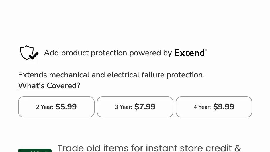
The tier buttons measure 133.50 × 37 at a verified 1440px and 117.33 × 56 at 390px — failing the 44 × 44 minimum on desktop and passing it on mobile. The cart pill shows the same inversion and fails at both widths.
The layout most likely to be reviewed — the desktop one, on the reviewer’s own screen — is the one that fails, and the failure disappears at the width where small targets are usually looked for.
Fix Set a minimum block size on the control rather than letting its height fall out of line-wrapping, so the target survives every breakpoint.
- 19
Two defaults for the same product, seconds apart
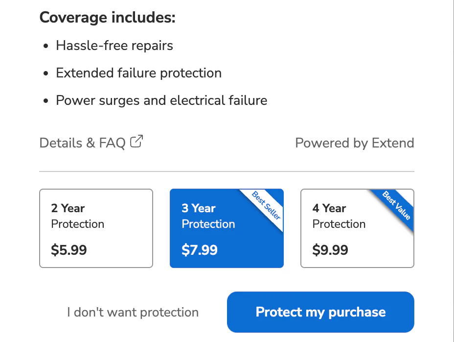
The widget above pre-selects nothing. The interstitial that fires on Add to cart pre-selects the 3-Year tier and ribbons it “Best Seller” — while “Best Value” sits on the 4-Year, the most expensive tier and not the default. Both ribbons are 8px bold, the smallest text in either flow.
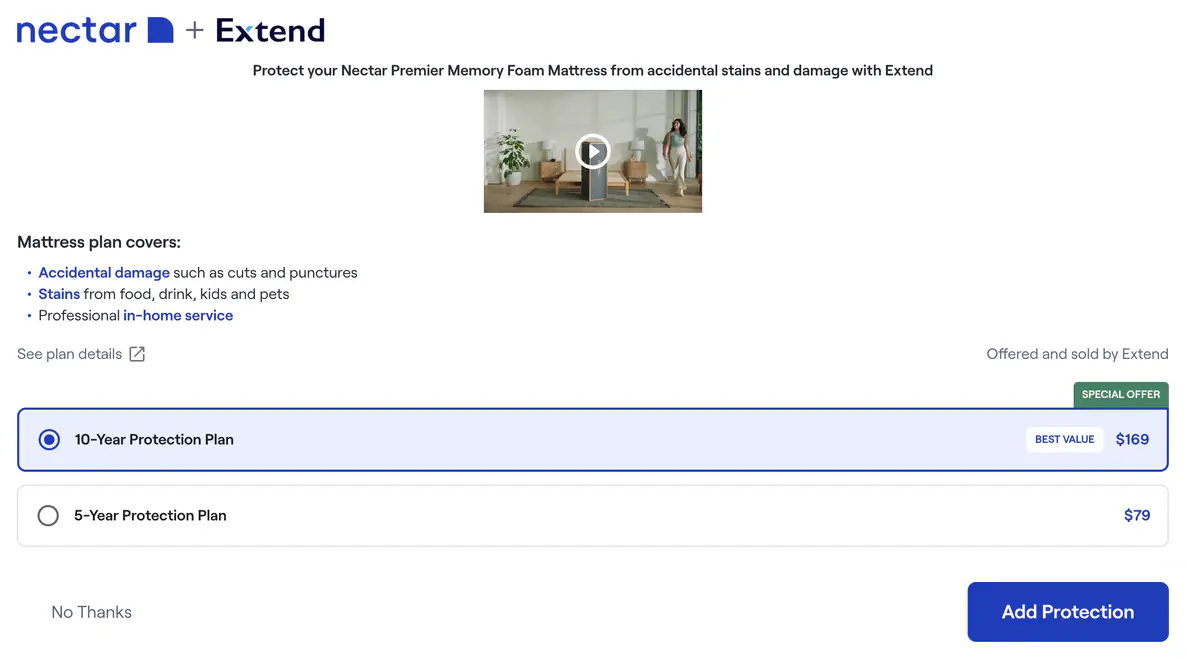
On Nectar the same platform puts “BEST VALUE” on the tier that is pre-selected, and that tier is also the costlier one. The same word points at the default on one merchant and away from it on the other.
Fix Pre-select nothing, and make any superlative a figure the customer can check — cost per year of coverage — rather than a ribbon.
Term and price share one line — 2 Year: .99. The button measures 133.50 × 37.
Term and price stack, which adds height and lets three buttons narrow enough to fit. The button measures 117.33 × 56.
The mechanism is layout, not styling. Height is the deciding dimension — 37 fails, 56 passes — and height here is a consequence of whether two strings share a line. Nothing in the component sets it. Reproduced in two separate sessions: an earlier run read 130 × 37 and 116 × 56, the same direction and the same verdict about 2% apart.
Three components, three different offers
Findings
- 18
Three components, three different offers
One merchant, one purchase journey, three separately-iframed components: the product-page widget, this interstitial, and the cart line-item pill. They differ in presentation, in what is pre-selected, and in whether declining is possible at all — the pill offers no decline, the interstitial does, the widget needs none because nothing is selected.
The customer is asked the same question up to three times in one journey, in three different shapes, and cannot tell whether a later screen is a repeat or a new decision.
Fix Carry one offer state across the journey, and let the later surfaces reflect the earlier answer instead of re-asking.
- 20
Single-choice controls with no state semantics
Tier selection on the widget and on this interstitial is three plain
<button>elements. Across all six controls, every one ofrole,aria-checked,aria-pressed,aria-selected,aria-currentand seven more is absent — on the selected control and the unselected ones alike. Neither frame holds arole="radiogroup", a<fieldset>, an<input type="radio">or any live region. Selecting a tier changes exactly one thing: it adds the class tokenactive, which changes only color.The control carries its state in color alone. A customer who cannot see that color change has no way to tell which term they are about to buy, and nothing announces that choosing one deselects the others.
Fix Make the group a radiogroup — native inputs in a fieldset, or
role="radio"witharia-checkedmaintained on selection.
The route to what the plan covers
Findings
- 21
Every route to coverage information fails the minimum
Four surfaces across both merchants. On Lorex:
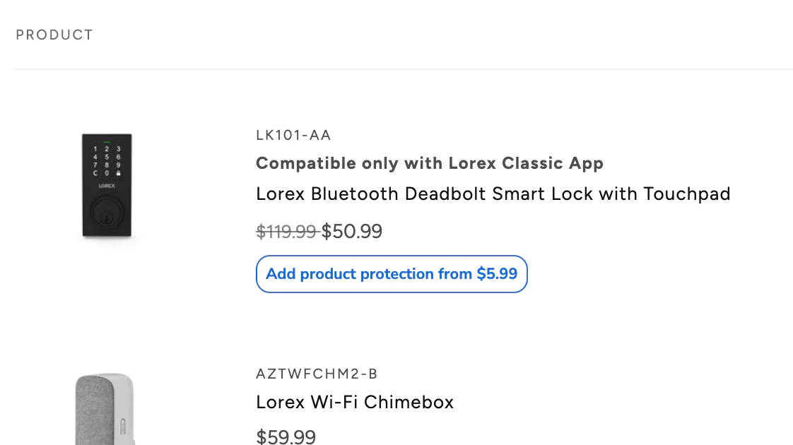
What’s Covered?on the product page, 108.53 × 19 at both widths;Details & FAQin the interstitial, 105.76 × 20; and this cart pill, which carries no coverage route at all. On Nectar:See plan detailsin the protection modal, 122.16 × 20 at both widths measured. Every one fails 44 × 44, while the controls that commit or decline stand 42 to 56 pixels tall.On every surface, the control that explains what the product is, is the hardest one to hit — and on the surface closest to payment it does not exist at all.
Fix Give the coverage link the hit area of the decision controls beside it, and put one on the cart pill.
- 22
Neither protection dialog announces what it is
Neither merchant’s protection dialog carries an accessible name, and each fails differently. The Lorex interstitial is an iframe with no
title, noaria-labeland noaria-labelledby— its entire attribute list isidandstyle— and the dialog inside it never declares itself a dialog at all. Six Extend frames were enumerated on Lorex and none is named, while other third-party frames on the same pages do carry titles.Nectar’s modal is not iframed and does declare
role="dialog"andaria-modal="true", but carries no name from any source; its close × is a bare<svg>with no role, no name and notabindex, absent from a tab order of five. A protection offer opens over the purchase and does not say what it is.Fix Name the dialog, declare it as one, and make the close affordance a real button.
How finding 20 was established, and what it does not claim. By enumerating attributes, not by reading the browser’s computed accessibility tree. The DevTools accessibility pane, getComputedAccessibleNode() and the CDP accessibility domain were each tried and were unavailable from the measuring session. What is reported is that no attribute capable of carrying the selected state is present on any of the six controls, and that no element type which would supply one implicitly is present either. That is a strong result and a narrower one than a screen-reader transcript would be.
Provider-scoped — reproduced on both merchants
Fourteen of the twenty belong to the integration rather than to either retailer, and six of those fourteen are the measured findings above. These are the other eight: what the offer block leaves out, and what the document does. Five of them are the disclosure thesis — 01, 02, 03, 06 and 16. The rest — support routing, the address the binding terms are served from, and the gap between what the offer describes and what the contract governs — turned up alongside it. The last two are set out in their own section below, because they are about the document rather than the flow.
What the offer block leaves out
Findings
- 01
Exclusions absent before purchase
No exclusion is stated anywhere in the purchase flow. The only statement of what isn't covered sits inside the contract, reachable after the decision point.
The customer buys believing they hold coverage they do not hold, and discovers the gap at claim time — the point of maximum damage to both parties.
Fix State the two or three most material exclusions inline at the offer, in the customer's own words, before accept or decline.
- 05
Support routed to the wrong party
The offer names Extend as seller but gives no contact route for plan questions at the point of sale.
Customers take plan questions to the retailer's support team, which cannot answer them, so both parties absorb the cost of a misrouted contact.
Fix Name the administrator's support route in the offer block and on the order confirmation.
The warranty question, asked in the wrong place
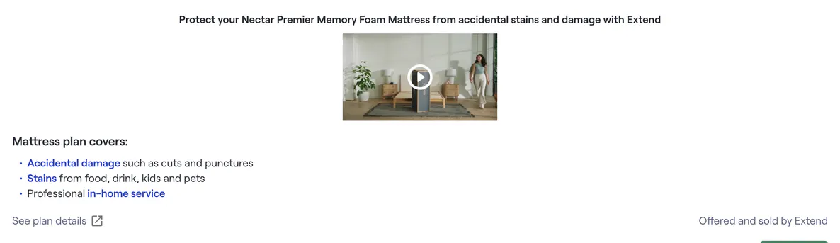

Finding
- 02
Warranty overlap undisclosed
The plan's coverage period overlaps the manufacturer warranty, and the relationship between the two appears only in the contract.
The customer cannot tell what the plan adds to protection they already have, so the price has nothing to be judged against.
Fix Show a coverage timeline at the offer marking where the manufacturer warranty ends and the plan begins.
Where the customer lives, established last
Finding
- 03
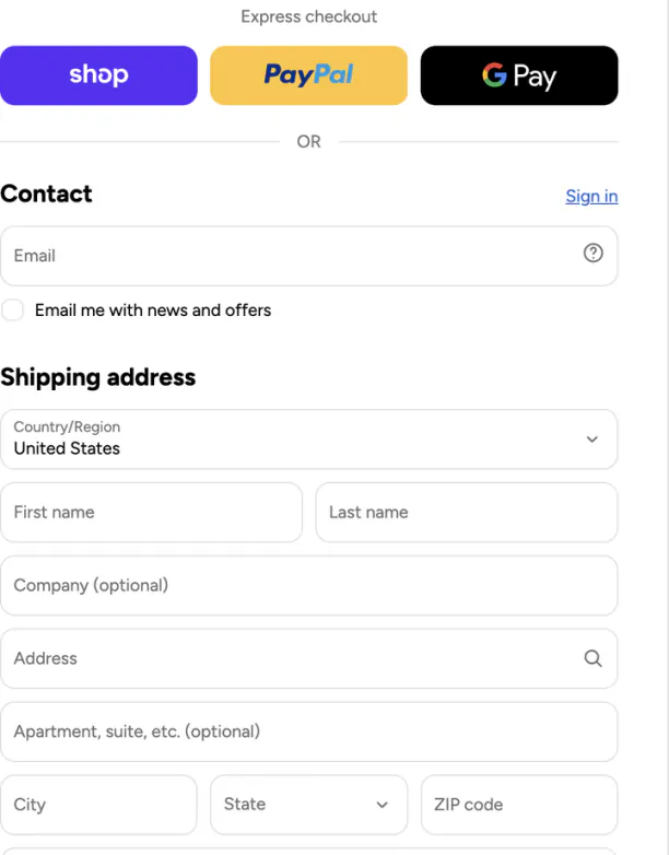
State availability checked too late
Protection can be added to the order before the customer's state is established. State is collected in the shipping form at checkout, after the plan is in the cart — and the express checkout controls sit above that form, so an express-checkout customer may never pass a state field in this step at all.
A customer can select and pay for coverage that isn't available where they live, then have it stripped from the order — or not stripped.
Fix Establish the delivery state before the offer renders, and suppress the plan where it isn't licensed.
The contract itself

Findings
- 06
Contract unreadable on mobile
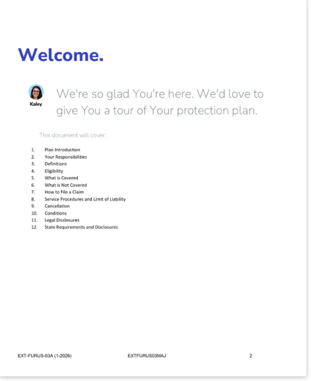
The contract is a fixed-width PDF that does not reflow at 390px. Body text scales down with the page; sections 1 through 3, which contain the warranty relationship, the definitions, and the administrator's contact details, render far below readable size.
On the device where most of these purchases happen, the terms are effectively undisclosed — the customer agrees to a document they cannot read.
Fix Serve the contract as responsive HTML, with the PDF as a secondary download.
- 14
Binding terms served from an unbranded storage URL
The contract loads from a raw object-storage hostname —
plantermsbucket2c3462b3-12kibrkvyj672.s3.amazonaws.com— with no merchant or provider domain anywhere in the address.The customer is asked to accept a binding contract on a page that matches what consumers are trained to treat as a phishing link, at the exact moment the flow is asking them to trust it.
Fix Serve contracts from a branded provider hostname.
Merchant-scoped — Nectar
Three findings observed on this merchant. Two of them — the decline treatment and the pre-selected tier — sit inside the Extend modal rather than around it; they are filed merchant-side because this pass observed them here, and a wider pass across more merchants could move them to the provider column.
Findings
- 08
Expensive tier pre-selected
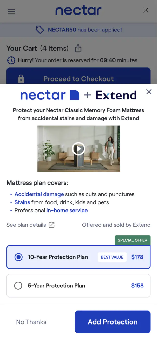
The longer, costlier plan is pre-selected on both viewports and carries “BEST VALUE” and “SPECIAL OFFER” badges. Desktop: 10-year $169 selected, 5-year $79. Mobile: 10-year $178 selected, 5-year $158.
The default does the choosing, and the badge supplies a justification the customer hasn't evaluated.
Fix Present both tiers unselected, and let “best value” be a computed per-year figure the customer can check rather than a badge.
- 09
A countdown runs during the protection-plan decision
On mobile, the cart behind the protection modal displays “Hurry! Your order is reserved for 09:40 minutes.”
Artificial time pressure is applied to a financial-product decision, at the moment the customer would otherwise read the terms.
Fix Suspend the reservation countdown while a protection offer is on screen.
- 10
Offer buried under the upsell stack
The protection offer arrives after several unrelated upsells, late in the purchase sequence.
The customer declines reflexively, so the offer is refused as part of a pattern rather than judged on merit.
Fix Move the protection offer ahead of the accessory and bundle upsells, and cap the number of offers shown in a single checkout.
Merchant-scoped — Lorex
A different category, a different price band, and a different set of merchant-side decisions — all three of them in the cart.
Findings
- 11
Offer is low-emphasis and price is indefinite
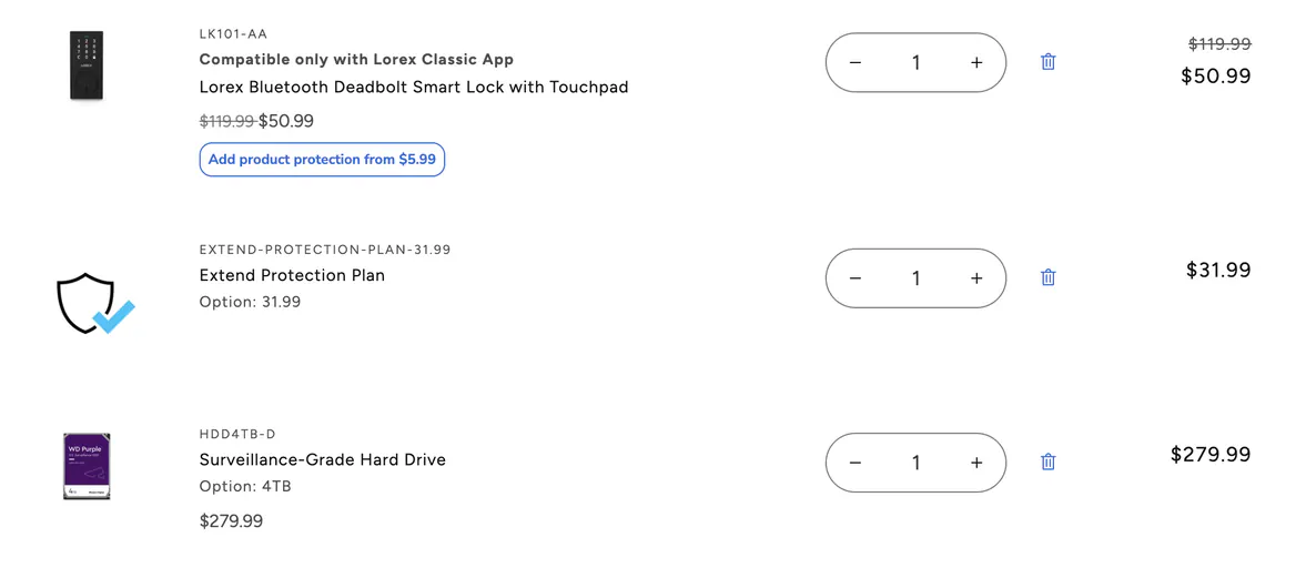
The per-item offer is a small outlined pill reading “Add product protection from $5.99” — a “from” price that doesn't resolve until the customer clicks. Measured, it is 192.37 × 27 at a verified 1440 and 158.50 × 42 at 390, failing 44 × 44 at both; its smallest text is 11px; and it carries no coverage explainer at all.
The offer reads as page furniture, and the price shown isn't the price charged, so neither the decision nor the cost is legible at the point of decision.
Fix Give the offer the visual weight of a decision and show the actual price for the item in the cart.
- 12
Protection sold as a quantity-adjustable SKU
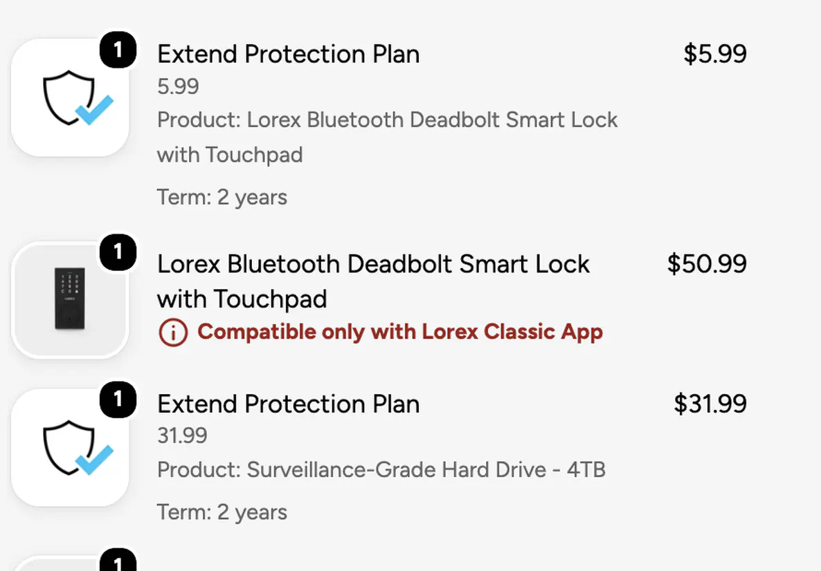
In the cart, the plan is a line item with a quantity stepper and a delete control. The SKU renders to the customer as
EXTEND-PROTECTION-PLAN-31.99, with “Option: 31.99” beneath it.A protection-plan contract is presented as stock a customer can order three of, and internal naming with the price embedded is exposed on the storefront.
Fix Render the plan as a non-quantifiable attachment to its covered item, with a customer-facing name.
- 13
The cart omits what the plan covers; checkout supplies it
In the cart the plan sits between two products with no product association. At checkout the same plan reads “Product: Surveillance-Grade Hard Drive – 4TB / Term: 2 years.”
The association exists in the system and is simply absent at the moment the customer decides — with two protectable items in the cart, they cannot tell which one they are covering.
Fix Show the covered product and term on the cart line item, matching what checkout already renders.
Contract versus flow
Everything above compares the offer to itself — what it says against what it leaves out. These last two findings compare it to the document it is selling. Both are provider-scoped, and both are a design review of the gap between the two texts, not an assessment of either against a statute.
Two documents, not one. Lorex sells EXT-REG-02EA (Consumer Products). Nectar sells EXT-FURUS-03A (Furniture). Their exclusions differ substantially — accidental damage is excluded on the Lorex plan and partly covered on Nectar — so nothing below attributes one document's terms to the other merchant.
The term worth advertising
- 16
The best term in the contract is the one nobody sees
Both contracts give a full refund within sixty days of purchase where no claim has been made. Neither offer states it anywhere — not in the modal reproduced at the top of this page, not in the coverage block, not beside either price.
The single strongest reason for a hesitant customer to say yes is withheld at the exact moment of hesitation.
Fix State the sixty-day refund window in the offer block, beside the price.
This one is worth leading with, because it runs the other way from everything else here: the flow is losing sales by under-disclosing, and the fix earns money rather than costing it.
What the offer promises, and what the agreement governs
- 15
The interface describes a product the contract doesn't recognize
The offer's coverage summary uses categories the governing contract either excludes or sequences differently — and both contracts state that representations by the selling retailer, and marketing materials outside the plan, carry no legal effect.
The description the customer relied on to decide is not part of what they bought. Every gap below surfaces at claim time, which is when the customer is least able to absorb it and most likely to blame the retailer.
Fix Generate the offer's coverage summary from the governing contract, so the two cannot drift.
Four proofs, all of them readable against the offer block at the top of this page:
- “Kids and pets.” The Nectar modal advertises stains from food, drink, kids and pets. The furniture contract excludes perspiration, hair oils and body oils, excludes anything accumulating gradually rather than from a single occurrence, treats repeated bodily-fluid incidents — naming incontinence — as non-accidental, and separately excludes animal damage from beaks, teeth and claws. The two scenarios the copy evokes are the two most clearly excluded, because both are repeated by nature.
- “Professional in-home service.” The contract's first service step is a cleaning kit and advice so the customer can attempt the stain themselves; a technician follows only if that fails and the customer reports back in time. The headline benefit is a fallback.
- Accidental damage, on the Lorex plan. The consumer products contract lists accidental damage among what is not covered, alongside cosmetic damage. Dropping the device is what most buyers believe an electronics plan is for, and nothing in the flow corrects that.
- The deductible. Both contracts defer it to the purchase confirmation. The customer cannot determine the effective cost of the plan before buying it — the price at the offer is not the price of using it.
Finding 23 — the one about the method
An automated accessibility audit calls this clean
- Violations1
- Color contrast0
- ARIA0
- Incomplete0
- Passes7
axe-core 4.10.2, WCAG 2.1 A and AA, run against the product-page component. The single violation is region, rated moderate, on two nodes: all page content should be contained by landmarks. Zero contrast violations, zero ARIA violations, seven passes.
It flagged none of the tap-target failures and none of the missing state semantics. A team running the standard automated audit sees a near-clean result on a component where three of four controls sit below the touch-target minimum and a single-choice control carries its state in color alone.
This is not a complaint about axe, which is a good tool reporting accurately on what it checks. It is the reason the six findings above had to be measured by hand. Automated coverage is the floor; the checks that failed here are the ones a person has to run.
axe-core was injected into the frame programmatically and the figures above are the axe.run() return value — there was no results panel involved. Rendered here as markup rather than reproduced as a screenshot, so the numbers stay checkable against the record.
The fix list
All twenty published findings, sorted by who owns them: fourteen provider-scoped, three on Nectar, three on Lorex. The scope column is the distinction the whole teardown turns on — a provider-scoped row is inherited by every merchant on the integration, and fixing it once fixes it everywhere.
| Finding | Scope | Commercial impact | Priority | Recommendation | Ship |
|---|---|---|---|---|---|
| 01 · Exclusions absent before purchase | Provider | Dispute risk | High | State the two or three most material exclusions inline at the offer, before accept or decline. | This quarter |
| 02 · Warranty overlap undisclosed | Provider | Trust / churn | Medium | Show a coverage timeline at the offer marking where the manufacturer warranty ends and the plan begins. | Next quarter |
| 03 · State availability checked too late | Provider | Dispute risk | High | Establish the delivery state before the offer renders, and suppress the plan where it isn't licensed. | This quarter |
| 05 · Support routed to the wrong party | Provider | Support cost | Medium | Name the administrator's support route in the offer block and on the order confirmation. | This quarter |
| 06 · Contract unreadable on mobile | Provider | Dispute risk | High | Serve the contract as responsive HTML, with the PDF as a secondary download. | This quarter |
| 14 · Binding terms served from an unbranded storage URL | Provider | Trust / churn | Medium | Serve contracts from a branded provider hostname. | This quarter |
| 15 · The interface describes a product the contract doesn't recognize | Provider | Trust / churn | High | Generate the offer's coverage summary from the governing contract, so the two cannot drift. | This quarter |
| 16 · The best term in the contract is the one nobody sees | Provider | Abandonment | High | State the sixty-day refund window in the offer block, beside the price. | This quarter |
| 17 · The tap-target failure inverts across breakpoints | Provider | Error rate | High | Set a minimum block size on the control rather than letting its height fall out of line-wrapping. | This quarter |
| 18 · Three components, three different offers | Provider | Trust / churn | High | Carry one offer state across the journey, so later surfaces reflect the earlier answer instead of re-asking. | Next quarter |
| 19 · Two defaults for the same product, seconds apart | Provider | Trust / churn | High | Pre-select nothing, and make any superlative a figure the customer can check rather than a ribbon. | This quarter |
| 20 · Single-choice controls with no state semantics | Provider | Error rate | High | Make the group a radiogroup — native inputs in a fieldset, or role="radio" with aria-checked maintained on selection. |
This quarter |
| 21 · Every route to coverage information fails the minimum | Provider | Dispute risk | High | Give the coverage link the hit area of the decision controls beside it, and put one on the cart pill. | This quarter |
| 22 · Neither protection dialog announces what it is | Provider | Error rate | Medium | Name the dialog, declare it as one, and make the close affordance a real button. | This quarter |
| 08 · Expensive tier pre-selected | Merchant · Nectar | Trust / churn | High | Present both tiers unselected, and let “best value” be a computed per-year figure rather than a badge. | This quarter |
| 09 · A countdown runs during the protection-plan decision | Merchant · Nectar | Dispute risk | High | Suspend the reservation countdown while a protection offer is on screen. | This quarter |
| 10 · Offer buried under the upsell stack | Merchant · Nectar | High friction | Medium | Move the protection offer ahead of the accessory and bundle upsells, and cap offers per checkout. | Next quarter |
| 11 · Offer is low-emphasis and price is indefinite | Merchant · Lorex | Error rate | High | Give the offer the visual weight of a decision and show the actual price for the item in the cart. | This quarter |
| 12 · Protection sold as a quantity-adjustable SKU | Merchant · Lorex | Trust / churn | Medium | Render the plan as a non-quantifiable attachment to its covered item, with a customer-facing name. | This quarter |
| 13 · The cart omits what the plan covers | Merchant · Lorex | Error rate | High | Show the covered product and term on the cart line item, matching what checkout already renders. | This quarter |
What passed
A teardown that records only failures reads as a hatchet job. All seven were tested.
- Decline control contrast: 6.05:1.
rgb(88, 98, 128)on white, measured at both 386 and verified 1440, against a 4.5:1 requirement. Tested on the hypothesis that it failed; it does not. Finding 07 is hierarchy and hit area only — there is no color problem here. - The administrator is named. “Offered and sold by Extend” appears on both modals.
- Coverage is stated on screen at the Nectar offer: accidental damage, stains, professional in-home service.
- The contract is one click from the offer on both merchants. Tested on the hypothesis that it was buried; it is not.
terms.clicks_to_contractis corrected from finding to pass on both merchants. - No price drift on Lorex, and prices were identical when the flows were re-checked from a US IP.
- Contrast on the Lorex components is genuinely clean. A uniform 13.97:1 across the product-page widget (
#2C2C2Con white) and 5.06:1 on the cart pill, both well clear of the 4.5:1 requirement. There is no contrast finding on Lorex, which is what leaves the tap-target and semantics findings standing on their own. - The uniform result was treated as suspect and checked, not accepted. Every text node in the widget returning the same 13.97:1 reads like a stuck probe. Hand-verified from first principles — the relative luminance of
#2C2C2Cis 0.0252, so 1.05 / 0.0752 = 13.96. Uniform, not stuck. A measurement that looks too clean gets verified rather than discarded.
Measurements
| Measure | Merchant | Desktop | Mobile | Threshold | Result |
|---|---|---|---|---|---|
| Decline control contrast | Nectar | 6.05:1 | 6.05:1 | 4.5:1 | Pass |
| Accept control size | Nectar | 244 × 45 | 185 × 47 | — | — |
| Decline control size | Nectar | 139.37 × 56 | 123 × 56 | 44 × 44 hit area | Pass |
| Plan prices | Nectar | $169 / $79 | $178 / $158 | — | — |
| Plan prices | Lorex | $5.99 / $31.99 | — | — | — |
| Tier button size | Lorex | 133.50 × 37 | 117.33 × 56 | 44 × 44 | Fail desktop |
| Cart pill size | Lorex | 192.37 × 27 | 158.50 × 42 | 44 × 44 | Fail both |
| Coverage link size | Lorex | 108.53 × 19 | 108.53 × 19 | 44 × 44 | Fail |
| Interstitial coverage link | Lorex | 105.76 × 20 | — | 44 × 44 | Fail |
| Coverage link size | Nectar | 122.16 × 20 | 122 × 20 | 44 × 44 | Fail |
| Widget text contrast | Lorex | 13.97:1 | 13.97:1 | 4.5:1 | Pass |
| Cart pill contrast | Lorex | 5.06:1 | — | 4.5:1 | Pass |
| Smallest offer text | Lorex | 8px ribbons | — | — | — |
| Smallest offer text | Nectar | 10px badges | 10px badges | — | — |
What this pass did not establish
- Post-purchase checks — proof of coverage, claims process, confirmation contact — were not reached. They require completing a purchase, which the protocol forbids.
- Two measurement bases are in play, and the difference matters. Findings 17 to 22 are DOM measurements. The earlier disclosure findings were read off screenshots, which gives glyph extents rather than hit areas. Where the two disagree, the DOM figure is the one published — that is how a finding about a decline control came to be retracted before publication rather than after.
- Finding 20 rests on attribute absence, not on the browser’s accessibility tree. The three routes to a computed tree were each tried and were unavailable from the measuring session. What was established is that no attribute capable of carrying the selected state is present on any of the six controls, and no element type that would supply one implicitly is present either.
- Finding 17 is reproduced on one merchant, not two. Every Nectar control holds a 56px height at both widths measured; only horizontal padding moves. Nectar does not show the inversion.
- The Nectar desktop and mobile runs were different mattress models (Premier and Classic), so the two price pairs are not directly comparable to each other. The Nectar accessibility measurements are from the Classic at both widths.
- Focus indicators were checked on Lorex only, and only after an earlier probe was found to be reading the wrong state: programmatic focus does not trigger
:focus-visible, so the first pass reported four controls with no focus ring that in fact have one. That claim was withdrawn before it reached this page.
Disclosure. No relationship with Extend, Lorex, Nectar, or Resident. Not engaged or compensated by any party. Public flows only, fictional persona data, no purchase completed.
Why this generalises
Strip out the mattresses and the security cameras and this is the disclosure problem every regulated purchase flow has: material terms held one layer behind the decision, a document that is technically available and practically unreadable, and a jurisdiction question answered after the money is committed. The same five checks apply to a quote flow that prices before it asks where you live, to an FNOL that takes a claim before stating what the policy excludes, and to a portal that puts the endorsement behind a PDF nobody can read on a phone.
Cover Genius, an embedded-protection platform, reports that presenting protection inside the checkout lifts purchase conversion by around eight percent — while fifty-eight percent of customers weren’t offered a plan on their most recent purchase at all. So most of that upside is still sitting on the table, and the decisions that claim it are design decisions: whether the offer appears, where it lands in the sequence, and whether it reads as worth taking.
The same pattern shows up in the regulatory record, where I read nineteen Virginia examinations of one statutory notice: the disclosure exists, and shipping it is nobody's job. The audit runs this protocol against your own flow — one journey, two weeks, a fix list sorted by who owns each row.